

A crucial step in creating a company’s identity is selecting the right colour.
The majority of designers and advertisers are familiar with the fundamentals of colour psychology. Colour is the key because it determines how branding and advertising as a whole turns out. Colour helps consumers’ brains identify products and the brands that create them.
The basis of colour psychology is the connection that our brains have with the different shades. Designers can match the perfect colours to the appropriate items by being mindful of this association. When you look at the products of a particular business, you will notice that many of the same colours are utilized repeatedly.
Is it a coincidence?
Not at all. Because these colours directly link the correct audience with the correct brand based on consumer expectations.
Selecting the right colour for the brand’s identity is a very important step. Because colours are loaded with emotions, choosing the right colour would help showcase your brand’s qualities.
Let’s dive deep into the color psychology to understand how brands leverage specific colours to achieve their marketing and advertising goals.
RED
It is a color of fire and blood. And it is associated with energy, love, and passion. It is vivid and catches the eye immediately. Red is also associated with anger, danger, and war. This red colour may be used by dating businesses in their branding to highlight passion and love whereas in restaurants to represent hot or spiciness. The colour red evokes strong emotions.
Red accentuates text and visual elements clearly. Use it as an accent hue to encourage visitors to make rapid decisions. It’s best for CTA buttons like ‘Buy Now’ or ‘Click Here’ buttons on Internet banners and websites as it immediately pulls focus. Red is also frequently used in advertising to elicit thoughts of romantic desire (red lips, red nails, red-light districts, “Lady in Red,” etc.). Danger is frequently denoted by the colour red (traffic lights, high voltage signs). You can use this colour to advertise food items, energy drinks, video games, vehicles, sporting goods, and other products that need a lot of physical activity because it is also commonly connected with energy.
Check out some brands’ logos in red.
1. McDonald’s
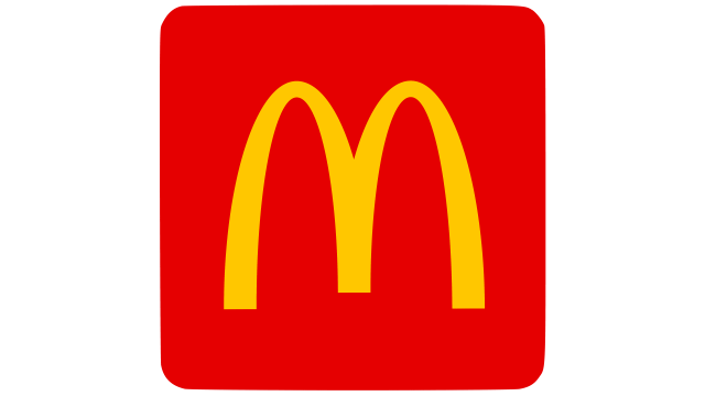
McDonald’s uses vibrant red (in combination with yellow) because it appeals to kids, stimulates appetites, and evokes a sensation of urgency. For McDonald’s, this strategy has worked wonders. It might not have been the incredibly large chain it is today, without the clever use of colour. Isn’t it?
McDonald’s wants you to feel passionate and emotional about its food items, and red is all about those things.
Target is another reason for choosing red as it draws customers’ attention. Mcdonald’s logo is one of the most recognizable logos in North America. It generates the desire to buy the brand’s fantastic offers or the latest, trendiest items as well as the joy of shopping there.
2. Coca-Cola
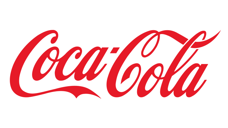
Actually, there was much debate on why this soft drink company picked red for its logo. Most people, however, think that it was a throwback to the brand’s very first advertisement, which featured Santa Claus (dressed in his distinguishing red and white coat and holding a Coca-Cola bottle!). However, the brand has discredited this myth over time and created its own version.
Coca-Cola started being dispensed in barrels at all American retailers as soon as inception was introduced. However, there was a small issue. The sale of alcohol was conducted similarly. So, to minimize the confusion, the brand chose to give its barrels a distinctive look by painting them red. Later, Coca-Cola made red its official colour and has stayed with it ever since.
The red colour in the coca-cola logo is to represent passion, youth, energy, love, and class.
3. Hero

The red,black and white colour palette is the most powerful three-color combination in expressing confidence, progress, and strength. And Hero logo has the same combination.
But, red is the main colour of the logo. And we all know, it’s one of the most intense colours. Its tremendous energy has a massive effect on a person’s psycho-emotional state.
Hero and other automakers around the world share a common love of the colour red. The red colour of the logo enables you to express the sense of the coolness of the rider and the power of the motorcycles and scooters. Such logos turn heads, encourage purchasing, spark interest in automobile ownership, and reflect strength and enthusiasm.
ORANGE
Orange appears scorching to the human eye because it is a very hot shade. Despite this, orange is less aggressive than red. Orange has an energizing effect, increases brain oxygenation, and enhances mental activity. Orange is a citrus colour that is connected to nutritious eating and stimulates appetite. It also symbolizes harvest and fall.
The colour orange is commonly connected to a friendly and upbeat environment. While it shares some traits with red, it also tends to make people think of youth and vitality. Hence, young folks generally embrace it. Additionally, orange represents value, friendship, and hilarity. Businesses catering to children may utilize orange as a strategy to grab children’s attention and conjure up excitement. Because of its high visibility, it can be used to catch attention and highlight the key elements of the design. Orange works incredibly well to promote toys and food items.
Check out some brands’ logos in orange.
1. Swiggy

Swiggy uses a color scheme that is not used by competitors, but is really similar to the food theme. It is a gentle, pumpkin-coloured orange-yellow that makes baked goods come to mind. This colour is purposely used as it subconsciously encourages customers to order food from this particular brand.
2. MasterCard

Two circles red and yellow in the Mastercard logo represent the interrelation of trading interests of Eastern and Western countries. The yellow component here represents the rising sun of the West, which presents many opportunities, while the red circle alludes to the flag of Japan. The intersected orange colour of the logo represents how the payment system connects the two parts of the world.
3. FedEx

The colour of the “Ex” in the name fluctuates on different displays, as you might have seen. It’s a clever approach to differentiate the various company departments. For instance, the colour green represents FedEx Ground, and the colour red represents FedEx Freight, the colour orange represents FedEx Express.
YELLOW
Yellow color is associated with sunshine, hope, laughter, warmth, happiness, and energy. It is known to stimulate spontaneous and cheerful feelings in people. A dash of yellow on any boring or gloomy surface can be brightened up to make one feel upbeat and optimistic. But if it is overused, may create a disturbing effect.
Men generally see yellow as a highly cheery, “childish” colour. Hence, it’s not at all advised to use yellow while marketing expensive products to men. No one will buy a yellow corporate suit or a yellow Mercedes.
Check out some brands’ logos in yellow.
1. Snapchat

Contrasting with the typical blue colour scheme of social media, Snapchat’s logo is yellow. The colour yellow evokes feelings of joy, excitement, and creativity among its young target audience.
2. Flipkart

Brightness and intensity are key components of the Flipkart logo. It is a combination of blue and yellow. Blue stands for quality and reliability and yellow stands for energy and passion.
3. Lipton

Since its early years, Lipton is using yellow and red as its brand colours. Here gradient yellow colour resembles the sun and expresses the feelings of warmth, love, and friendship.
GREEN
It is the colour of nature. It signifies growth, peace, radiance, and abundance. The colour green strongly evokes feeling of safety. Dark green is commonly linked to money as well.
Green has a powerful ability to heal. The human eye finds it to be the most calming colour, and it helps enhance vision. Green denotes strength and endurance. At times, green colour is used to represent lack of experience. For instance, a “greenhorn” is a newbie.
The green colour is also associated with many other different things, such as balance, success, and health. Green is calming and considered a symbol of life. A lot of eco-friendly companies mark themselves with a green hue.
Check out some brands’ logos in green.
1. Starbucks
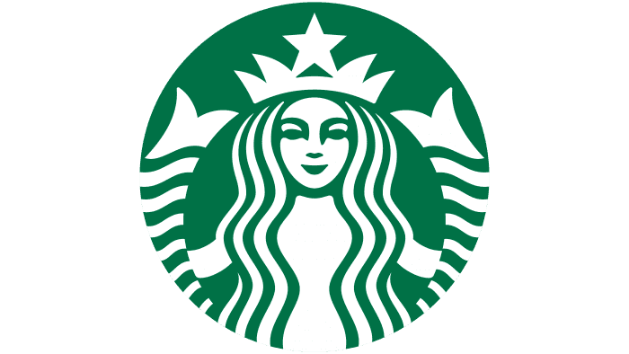
The brand colours of Starbucks are green and white. The background colour of the Starbucks logo is mainly green, while the main siren symbol is white.
Green is the colour of nature, healing, and protection. Moreover, it represents wealth. Knowing coffee is a plant hence it’s not all surprising that the main colour of the logo is green.
But there’s another reason why green appears in the Starbucks logo. Over the years, Starbucks has been sourcing coffee in an ethical manner. So, they want and ensure the farmers they work with are treated with respect. Starbucks wants customers to see it as a company with social responsibility by using green in its logo.
2. Sprite

Since 1961, green has been the company’s signature colour. Sprite is known for its fresh lemon taste and the green colour of it represents the sparklines and lemon taste of the iconic drink.
3. WhatsApp

The green color of the background is giving the green signal symbolizing that the WhatsApp lines are always free to communicate.
BLUE
The sky and the ocean both are blue in colour. It usually symbolizes depth and solidity. It represents faith, honesty, loyalty, intellect, wisdom, trust, and heaven. Like water blue colour evokes the feelings of calmness and tranquility. It’s completely a non-aggressive colour but an appetite suppressor colour too. So if you are promoting food and cooking then avoid using blue colour.
Check out some brands’ logos in Blue.
1. Dell

The colour that tech brands adore the most is blue. It identifies the frame and the brand name of Dell as one of its official colors. Blue in Dell logo represents trust, loyalty, and wisdom.
2. Twitter

Firstly, the name of this social media site, which is associated with the chirping of birds, is represented by the famous blue and white Twitter logo with a cute playful bird. And the colour blue in twitter’s logo represents safety.
3. Oral-B
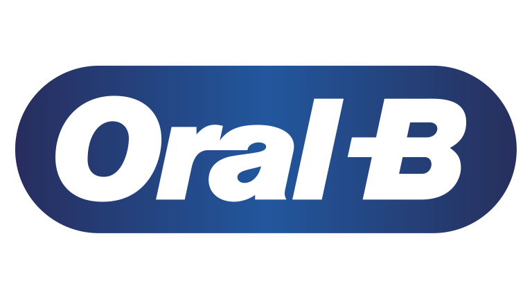
The Oral B logo’s white and blue colour scheme wonderfully captures the brand’s mission and its focus on mouth-care products where white stands for freshness and blue for safety.
BLACK
It is associated with elegance, power, formality, evil, mystery and death. The mysterious black is linked to anxiety and the unknown. Usually associated with bad things like blacklisting, black humour, etc. Black is somber, aristocratic, and prestigious colour since it symbolises power and authority like black Mercedes and black tie.
Black creates a sense of depth and perspective, yet a black background makes text harder to read. You can look slimmer by wearing a black suit or dress. You can use a black or grey background when creating a design for a gallery of art or photography to make the other colours stand out. Bright hues contrast beautifully with black. Black creates an extremely powerful colour scheme when combined with red or orange, two other very aggressive tones.
Check out some brands’ logos in Black
1. Chanel

Chanel utilizes black as a purely neutral, serving as a way to enhance their products, showing that they are anything but basic. The brand’s values are compatible with the striking luxury of this logo.
2. Adidas

Although black and white may not seem like particularly inventive colour combinations for a clothing or athletic brand, they are incredibly versatile. Here white stands for creativity and vision and black depicts ideas of power and strength.
3. Loreal

L’Oreal has a very simple logo with no hidden meanings because it contains only the brand name. True beauty lies in simplicity, isn’t it? In this logo black color represents mysticism, and white represents naturalness and purity.
Colour psychology will impact your marketing so keep that in mind. How well your brand colours complement your company will be evaluated by the color schemes you choose for your brand. So, choose wisely!